The navigation property in docs.json controls the structure and information hierarchy of your documentation. With proper navigation configuration, you can organize your content so that users can find exactly what they’re looking for. Choose one primary organizational pattern at the root level of your navigation. Once you’ve chosen your primary pattern, you can nest other navigation elements within it.

Pages

Pages are the most fundamental navigation component. Each page is an MDX file in your documentation repository. Decorative graphic of pages. In the 
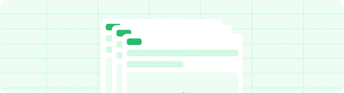
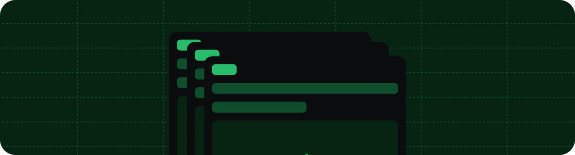
navigation object, pages is an array where each entry must reference the path to a page file.
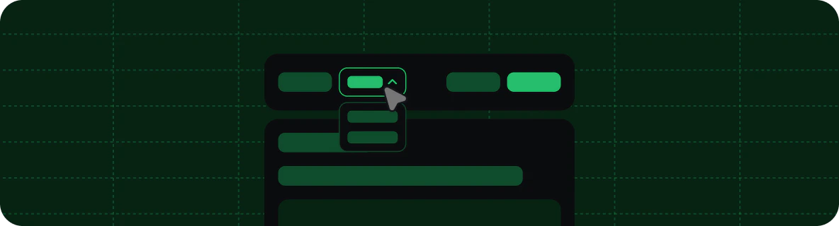
{
  "navigation": {
    "pages": [
      "settings",
      "pages",
      "navigation",
      "themes",
      "custom-domain"
    ]
  }
}

Groups

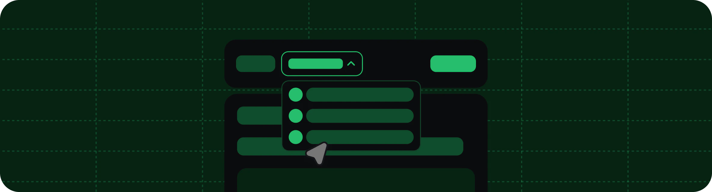
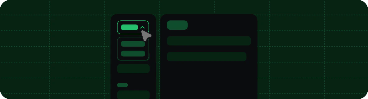
Use groups to organize your sidebar navigation into sections. You can nest groups within each other, label them with tags, and style them with icons. Decorative graphic of groups. In the 
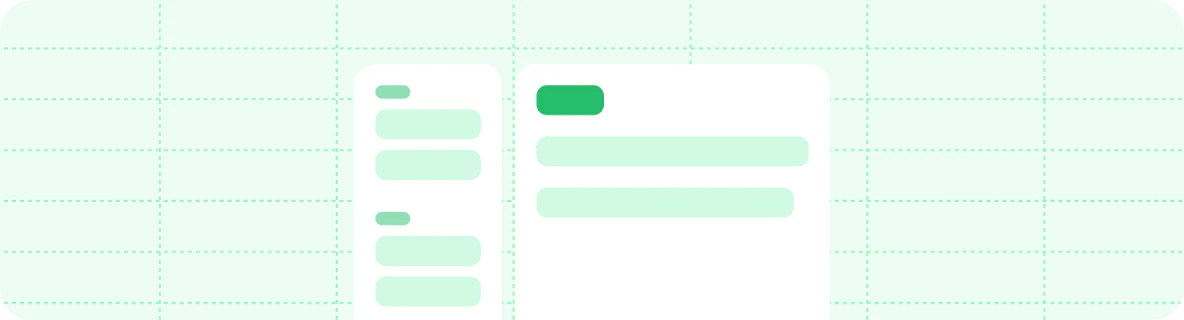
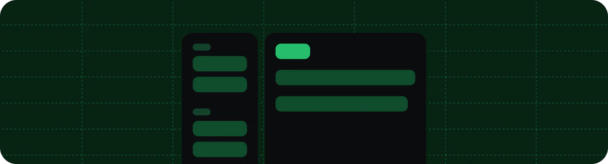
navigation object, groups is an array where each entry is an object that requires a group field and a pages field. The icon, tag, root, and expanded fields are optional.
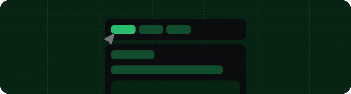
{
  "navigation": {
    "groups": [
      {
        "group": "Getting started",
        "icon": "play",
        "pages": [
          "quickstart",
          {
            "group": "Editing",
            "expanded": false,
            "icon": "pencil",
            "pages": [
              "installation",
              "editor"
            ]
          }
        ]
      },
      {
        "group": "Writing content",
        "icon": "notebook-text",
        "tag": "NEW",
        "pages": [
          "writing-content/page",
          "writing-content/text"
        ]
      }
    ]
  }
}

Root page

Use the root property to designate a main page for a group. When a group has a root page, clicking the group title in the sidebar navigation opens the root page. Root pages work for top-level and nested groups.
Example group with a root page
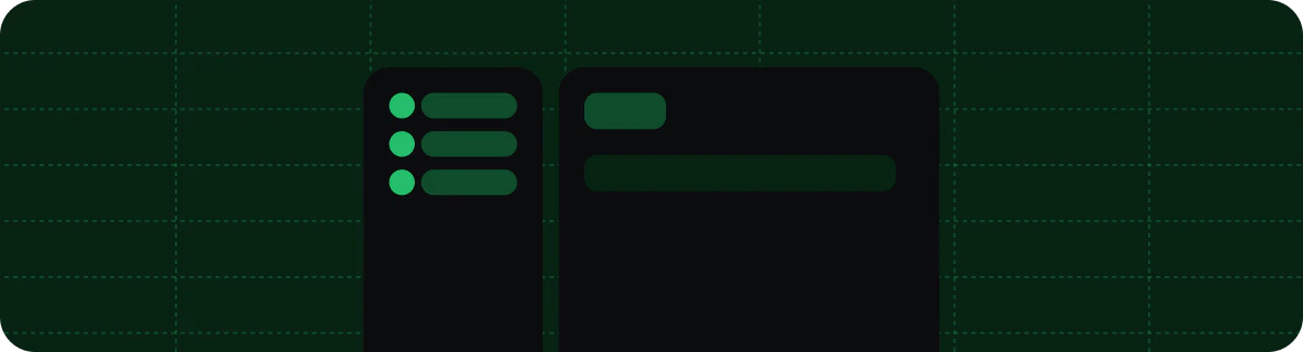
{
  "navigation": {
    "groups": [
      {
        "group": "API pages",
        "root": "api-overview",
        "pages": [
          "api-reference/get",
          "api-reference/post",
          "api-reference/delete"
        ]
      }
    ]
  }
}

Directory listings

Use the directory property to automatically render a directory of child pages and groups on group root pages. When you set directory on any object within the navigation tree in docs.json, groups with a root page matching or beneath that object display a listing of their pages and groups below their page contents. The directory property accepts three values:
ValueBehavior
"none"No directory listing. Default value.
"accordion"Displays child pages in a collapsible list grouped by section.
"card"Displays child pages in a horizontal card layout.
The directory value inherits recursively through the navigation tree. Set it on anywhere within the navigation object and all descendant groups inherit the same value. Any descendant can override the inherited value by setting directory to a different value. You can set directory anywhere in the navigation object in your docs.json file, including on tabs, anchors, dropdowns, products, versions, languages, and individual groups.
{
  "navigation": {
    "groups": [
      {
        "group": "Help Center",
        "root": "help/index",
        "directory": "accordion",
        "pages": [
          {
            "group": "Getting Started",
            "root": "help/getting-started/index",
            "pages": [
              "help/getting-started/quickstart",
              "help/getting-started/install"
            ]
          },
          {
            "group": "API Reference",
            "root": "help/api/index",
            "directory": "none",
            "pages": [
              "help/api/overview",
              "help/api/endpoints"
            ]
          }
        ]
      }
    ]
  }
}
In this example:
  • Help Center uses "accordion" and its root page displays a directory listing.
  • Getting Started inherits "accordion" from its parent and also displays a directory listing.
  • API Reference overrides with "none", so its root page does not display a directory listing.
The directory property only affects groups that have a root page. Groups without a root page are not affected.

Default expanded state

Use the expanded property to control the default state of a nested group in the navigation sidebar.
  • expanded: true: Expands the group by default.
  • expanded: false or omitted: Collapses the group by default.
The expanded property only affects nested groups—groups within groups. Top-level groups always expand and you cannot collapse them.
{
  "group": "Getting started",
  "pages": [
    "quickstart",
    {
      "group": "Advanced",
      "expanded": false,
      "pages": ["installation", "configuration"]
    }
  ]
}

Tabs

Tabs create distinct sections of your documentation with separate URL paths. Tabs create a horizontal navigation bar at the top of your documentation that lets users switch between sections. Decorative graphic of a tab navigation. In the 
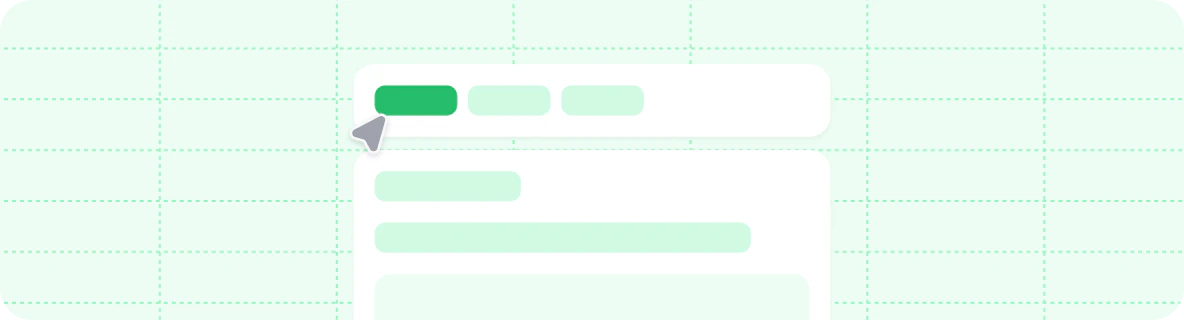
navigation object, tabs is an array where each entry is an object that requires a tab field and can contain other navigation fields such as groups, pages, icons, or links to external pages.
{
  "navigation": {
    "tabs": [
      {
        "tab": "API reference",
        "icon": "square-terminal",
        "pages": [
          "api-reference/get",
          "api-reference/post",
          "api-reference/delete"
        ]
      },
      {
        "tab": "SDKs",
        "icon": "code",
        "pages": [
          "sdk/fetch",
          "sdk/create",
          "sdk/delete"
        ]
      },
      {
        "tab": "Blog",
        "icon": "newspaper",
        "href": "https://external-link.com/blog"
      }
    ]
  }
}
Menus add dropdown navigation items to a tab. Use menus to help users go directly to specific pages within a tab. In the navigation object, menu is an array where each entry is an object that requires an item field and can contain other navigation fields such as groups, pages, icons, or links to external pages. Menu items can only contain groups, pages, and external links.
{
  "navigation": {
    "tabs": [
      {
        "tab": "Developer tools",
        "icon": "square-terminal",
        "menu": [
          {
            "item": "API reference",
            "icon": "rocket",
            "groups": [
              {
                "group": "Core endpoints",
                "icon": "square-terminal",
                "pages": [
                  "api-reference/get",
                  "api-reference/post",
                  "api-reference/delete"
                ]
              }
            ]
          },
          {
            "item": "SDKs",
            "icon": "code",
            "description": "SDKs are used to interact with the API.",
            "pages": [
              "sdk/fetch",
              "sdk/create",
              "sdk/delete"
            ]
          }
        ]
      }
    ]
  }
}

Anchors

Anchors add persistent navigation items to the top of your sidebar. Use anchors to section your content, provide quick access to external resources, or create prominent calls to action. Decorative graphic of an anchor navigation. In the 
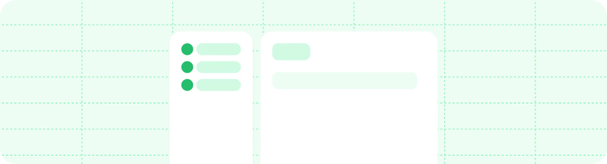
navigation object, anchors is an array where each entry is an object that requires an anchor field and can contain other navigation fields such as groups, pages, icons, or links to external pages.
{
  "navigation": {
    "anchors": [
      {
        "anchor": "Documentation",
        "icon": "book-open",
        "pages": [
          "quickstart",
          "development",
          "navigation"
        ]
      },
      {
        "anchor": "API reference",
        "icon": "square-terminal",
        "pages": [
          "api-reference/get",
          "api-reference/post",
          "api-reference/delete"
        ]
      },
      {
        "anchor": "Blog",
        "href": "https://external-link.com/blog"
      }
    ]
  }
}

Global anchors

Use global anchors for links that should appear on all pages, regardless of which section of your navigation the user is viewing. Global anchors are particularly useful for linking to resources outside your documentation (such as a blog, community forum, or support portal) or for providing consistent access to important internal pages (such as a changelog or status page). Global anchors support both external URLs and relative paths to pages within your documentation.
{
  "navigation": {
    "global":  {
      "anchors": [
        {
          "anchor": "Changelog",
          "icon": "list",
          "href": "/changelog"
        },
        {
          "anchor": "Blog",
          "icon": "pencil",
          "href": "https://mintlify.com/blog"
        }
      ]
    },
    "tabs": /*...*/
  }
}

Products

Decorative graphic of a product switcher. Products create a dedicated navigation division for organizing product-specific documentation. Use products to separate different offerings, services, or major feature sets within your documentation. In the navigation object, products is an array where each entry is an object that requires a product field and can contain other navigation fields such as groups, pages, icons, or links to external pages.
{
  "navigation": {
    "products": [
      {
        "product": "Core API",
        "description": "Core API description",    
        "icon": "api",
        "groups": [
          {
            "group": "Getting started",
            "pages": [
              "core-api/quickstart",
              "core-api/authentication"
            ]
          },
          {
            "group": "Endpoints",
            "pages": [
              "core-api/users",
              "core-api/orders"
            ]
          }
        ]
      },
      {
        "product": "Analytics Platform",
        "description": "Analytics Platform description",
        "icon": "chart-bar",
        "pages": [
          "analytics/overview",
          "analytics/dashboard",
          "analytics/reports"
        ]
      },
      {
        "product": "Mobile SDK",
        "description": "Mobile SDK description",
        "icon": "smartphone",
        "href": "https://mobile-sdk-docs.example.com"
      }
    ]
  }
}
Dropdowns are an expandable menu at the top of your sidebar navigation. Each item in a dropdown directs to a section of your documentation. Decorative graphic of a dropdown navigation. In the 
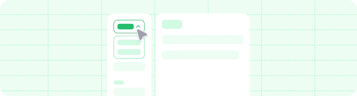
navigation object, dropdowns is an array where each entry is an object that requires a dropdown field and can contain other navigation fields such as groups, pages, icons, or links to external pages.
{
  "navigation": {
    "dropdowns": [
      {
        "dropdown": "Documentation",
        "icon": "book-open",
        "pages": [
          "quickstart",
          "development",
          "navigation"
        ]
      },
      {
        "dropdown": "API reference",
        "icon": "square-terminal",
        "pages": [
          "api-reference/get",
          "api-reference/post",
          "api-reference/delete"
        ]
      },
      {
        "dropdown": "Blog",
        "href": "https://external-link.com/blog"
      }
    ]
  }
}

OpenAPI

Integrate OpenAPI specifications directly into your navigation structure to automatically generate API documentation. Create dedicated API sections or place endpoint pages within other navigation components. Set a default OpenAPI specification at any level of your navigation hierarchy. Child elements inherit the specification unless they define their own.
When you add the openapi property to a navigation element (such as an anchor, tab, or group) without specifying any pages, Mintlify automatically generates pages for all endpoints defined in your OpenAPI specification.To control which endpoints appear, explicitly list the desired endpoints in a pages array.
For more information about referencing OpenAPI endpoints in your docs, see the OpenAPI setup.
{
  "navigation": {
    "groups": [
      {
        "group": "API reference",
        "openapi": "/path/to/openapi-v1.json",
        "pages": [
          "overview",
          "authentication",
          "GET /users",
          "POST /users",
          {
            "group": "Products",
            "openapi": "/path/to/openapi-v2.json",
            "pages": [
              "GET /products",
              "POST /products"
            ]
          }
        ]
      }
    ]
  }
}

Versions

Partition your navigation into different versions. Versions are selectable from a dropdown menu. Decorative graphic of a version switcher. In the 
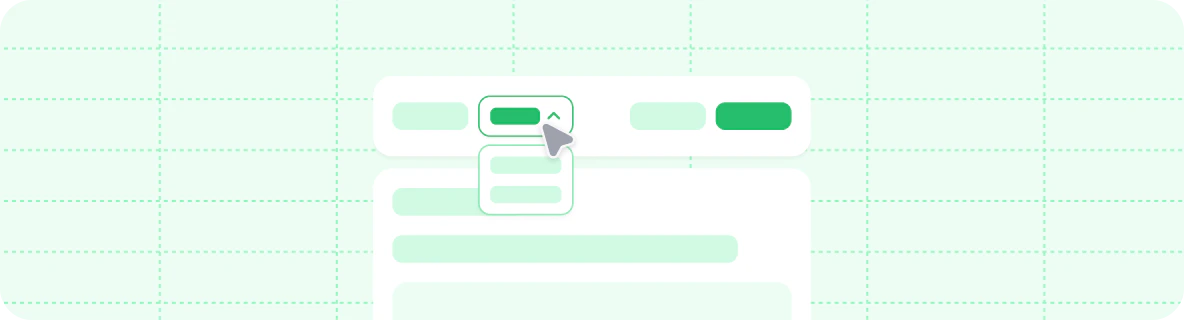
navigation object, versions is an array where each entry is an object that requires a version field and can contain any other navigation fields.
{
  "navigation": {
    "versions": [
      {
        "version": "1.0.0",
        "groups": [
          {
            "group": "Getting started",
            "pages": ["v1/overview", "v1/quickstart", "v1/development"]
          }
        ]
      },
      {
        "version": "2.0.0",
        "groups": [
          {
            "group": "Getting started",
            "pages": ["v2/overview", "v2/quickstart", "v2/development"]
          }
        ]
      }
    ]
  }
}

Default version

Mintlify uses the first version in the versions array as the default. Use the default field to specify a different version as the default.
{
  "navigation": {
    "versions": [
      {
        "version": "1.0.0",
        "groups": [
          {
            "group": "Getting started",
            "pages": ["v1/overview", "v1/quickstart"]
          }
        ]
      },
      {
        "version": "2.0.0",
        "default": true,
        "groups": [
          {
            "group": "Getting started",
            "pages": ["v2/overview", "v2/quickstart"]
          }
        ]
      }
    ]
  }
}

Version tags

Add a badge label to version entries in the version selector dropdown using the optional tag field. Use tags to highlight specific versions such as “Latest,” “Recommended,” or “Beta.”
{
  "navigation": {
    "versions": [
      {
        "version": "2026_03",
        "tag": "Latest",
        "groups": [
          {
            "group": "Getting started",
            "pages": ["getting-started", "quickstart"]
          }
        ]
      },
      {
        "version": "2025_12",
        "tag": "Recommended",
        "groups": [
          {
            "group": "Getting started",
            "pages": ["2025_12/getting-started", "2025_12/quickstart"]
          }
        ]
      },
      {
        "version": "2025_09",
        "tag": "Deprecated",
        "groups": [
          {
            "group": "Getting started",
            "pages": ["2025_09/getting-started", "2025_09/quickstart"]
          }
        ]
      }
    ]
  }
}

Languages

Partition your navigation into different languages. Languages are selectable from a dropdown menu. Decorative graphic of a language switcher. In the navigation object, languages is an array where each entry is an object that requires a language field and can contain any other navigation fields, including language-specific banner, footer, and navbar configurations. We currently support the following languages for localization:
https://mintcdn.com/mintlify-mintlify-vale-vocab-1776214452/1MsARCc0z7noQDdw/images/navigation/languages/ar.png?fit=max&auto=format&n=1MsARCc0z7noQDdw&q=85&s=bf43f01ad3a843561191adc0590dc3e4

Arabic (ar)

https://mintcdn.com/mintlify-mintlify-vale-vocab-1776214452/1MsARCc0z7noQDdw/images/navigation/languages/ca.png?fit=max&auto=format&n=1MsARCc0z7noQDdw&q=85&s=348f18900de266f59ea26864e52bb701

Catalan (ca)

https://mintcdn.com/mintlify-mintlify-vale-vocab-1776214452/1MsARCc0z7noQDdw/images/navigation/languages/cs.png?fit=max&auto=format&n=1MsARCc0z7noQDdw&q=85&s=c4244b6547cdbcd9bd66d54c6be097fd

Czech (cs)

https://mintcdn.com/mintlify-mintlify-vale-vocab-1776214452/1MsARCc0z7noQDdw/images/navigation/languages/cn.png?fit=max&auto=format&n=1MsARCc0z7noQDdw&q=85&s=cbfdb0ad14d23cc93c0c4853af9fa4cc

Chinese (cn)

https://mintcdn.com/mintlify-mintlify-vale-vocab-1776214452/1MsARCc0z7noQDdw/images/navigation/languages/cn.png?fit=max&auto=format&n=1MsARCc0z7noQDdw&q=85&s=cbfdb0ad14d23cc93c0c4853af9fa4cc

Chinese (zh-Hant)

https://mintcdn.com/mintlify-mintlify-vale-vocab-1776214452/1MsARCc0z7noQDdw/images/navigation/languages/nl.png?fit=max&auto=format&n=1MsARCc0z7noQDdw&q=85&s=b1667c357fffe0ccb4fa05c4064372ae

Dutch (nl)

https://mintcdn.com/mintlify-mintlify-vale-vocab-1776214452/1MsARCc0z7noQDdw/images/navigation/languages/en.png?fit=max&auto=format&n=1MsARCc0z7noQDdw&q=85&s=8eea9f01ab3aa24154350a629e59f979

English (en)

https://mintcdn.com/mintlify-mintlify-vale-vocab-1776214452/1MsARCc0z7noQDdw/images/navigation/languages/fi.png?fit=max&auto=format&n=1MsARCc0z7noQDdw&q=85&s=82f6d912d7186c6639192142beec472f

Finnish (fi)

https://mintcdn.com/mintlify-mintlify-vale-vocab-1776214452/1MsARCc0z7noQDdw/images/navigation/languages/fr.png?fit=max&auto=format&n=1MsARCc0z7noQDdw&q=85&s=619e858922ed50f4fea02d37a8a0595a

French (fr)

https://mintcdn.com/mintlify-mintlify-vale-vocab-1776214452/1MsARCc0z7noQDdw/images/navigation/languages/de.png?fit=max&auto=format&n=1MsARCc0z7noQDdw&q=85&s=cc5cb86c3064aa7c04a474dddee546fb

German (de)

https://mintcdn.com/mintlify-mintlify-vale-vocab-1776214452/1MsARCc0z7noQDdw/images/navigation/languages/he.png?fit=max&auto=format&n=1MsARCc0z7noQDdw&q=85&s=22b7914dbdc48785a6f0bad5ec642ee1

Hebrew (he)

https://mintcdn.com/mintlify-mintlify-vale-vocab-1776214452/1MsARCc0z7noQDdw/images/navigation/languages/hi.png?fit=max&auto=format&n=1MsARCc0z7noQDdw&q=85&s=96552d048addd36b8548f55404e4ba41

Hindi (hi)

https://mintcdn.com/mintlify-mintlify-vale-vocab-1776214452/1MsARCc0z7noQDdw/images/navigation/languages/hu.png?fit=max&auto=format&n=1MsARCc0z7noQDdw&q=85&s=dac0b960ba63eba27444984f80ec6022

Hungarian (hu)

https://mintcdn.com/mintlify-mintlify-vale-vocab-1776214452/1MsARCc0z7noQDdw/images/navigation/languages/id.png?fit=max&auto=format&n=1MsARCc0z7noQDdw&q=85&s=f314a0b6c0754abadde2f3e2afe4650c

Indonesian (id)

https://mintcdn.com/mintlify-mintlify-vale-vocab-1776214452/1MsARCc0z7noQDdw/images/navigation/languages/it.png?fit=max&auto=format&n=1MsARCc0z7noQDdw&q=85&s=d5c4980b8b6770afc838a2cd837bbde0

Italian (it)

https://mintcdn.com/mintlify-mintlify-vale-vocab-1776214452/1MsARCc0z7noQDdw/images/navigation/languages/jp.png?fit=max&auto=format&n=1MsARCc0z7noQDdw&q=85&s=2e712edb9d4a5cc4545785e2565e3847

Japanese (jp)

https://mintcdn.com/mintlify-mintlify-vale-vocab-1776214452/1MsARCc0z7noQDdw/images/navigation/languages/ko.png?fit=max&auto=format&n=1MsARCc0z7noQDdw&q=85&s=70aeed373c4b7944f8ece5f5ceaa02eb

Korean (ko)

https://mintcdn.com/mintlify-mintlify-vale-vocab-1776214452/1MsARCc0z7noQDdw/images/navigation/languages/lv.png?fit=max&auto=format&n=1MsARCc0z7noQDdw&q=85&s=2b9f5dafd8d337c52c2c1f668fb41868

Latvian (lv)

https://mintcdn.com/mintlify-mintlify-vale-vocab-1776214452/1MsARCc0z7noQDdw/images/navigation/languages/no.png?fit=max&auto=format&n=1MsARCc0z7noQDdw&q=85&s=edf4ab4ef724b6c1d13cb017c3d14b7a

Norwegian (no)

https://mintcdn.com/mintlify-mintlify-vale-vocab-1776214452/1MsARCc0z7noQDdw/images/navigation/languages/pl.png?fit=max&auto=format&n=1MsARCc0z7noQDdw&q=85&s=3a529cf81557b1942655144f58d7ffec

Polish (pl)

https://mintcdn.com/mintlify-mintlify-vale-vocab-1776214452/1MsARCc0z7noQDdw/images/navigation/languages/pt-br.png?fit=max&auto=format&n=1MsARCc0z7noQDdw&q=85&s=7b3dfba28268ffffd267e112bb724e8a

Portuguese (pt-BR)

https://mintcdn.com/mintlify-mintlify-vale-vocab-1776214452/1MsARCc0z7noQDdw/images/navigation/languages/ro.png?fit=max&auto=format&n=1MsARCc0z7noQDdw&q=85&s=c74adead6b9413e0589f9a973e54a661

Romanian (ro)

https://mintcdn.com/mintlify-mintlify-vale-vocab-1776214452/1MsARCc0z7noQDdw/images/navigation/languages/ru.png?fit=max&auto=format&n=1MsARCc0z7noQDdw&q=85&s=18b9ff3e2ed076d7fbbc142ba2960d44

Russian (ru)

https://mintcdn.com/mintlify-mintlify-vale-vocab-1776214452/1MsARCc0z7noQDdw/images/navigation/languages/es.png?fit=max&auto=format&n=1MsARCc0z7noQDdw&q=85&s=ba323759a59eb49b40f84b027f136ce7

Spanish (es)

https://mintcdn.com/mintlify-mintlify-vale-vocab-1776214452/1MsARCc0z7noQDdw/images/navigation/languages/sv.png?fit=max&auto=format&n=1MsARCc0z7noQDdw&q=85&s=39c33fe08a8b495dd2a8e0c87cabcca6

Swedish (sv)

https://mintcdn.com/mintlify-mintlify-vale-vocab-1776214452/1MsARCc0z7noQDdw/images/navigation/languages/tr.png?fit=max&auto=format&n=1MsARCc0z7noQDdw&q=85&s=98f9c2458eb29962060fb1205836eeae

Turkish (tr)

https://mintcdn.com/mintlify-mintlify-vale-vocab-1776214452/1MsARCc0z7noQDdw/images/navigation/languages/ua.png?fit=max&auto=format&n=1MsARCc0z7noQDdw&q=85&s=111a1b2d7e9fe1d66bf8ed191d81b02e

Ukrainian (uk)

https://mintcdn.com/mintlify-mintlify-vale-vocab-1776214452/1MsARCc0z7noQDdw/images/navigation/languages/uz.png?fit=max&auto=format&n=1MsARCc0z7noQDdw&q=85&s=3b043f03184fbd6213cac61821ecf8eb

Uzbek (uz)

https://mintcdn.com/mintlify-mintlify-vale-vocab-1776214452/1MsARCc0z7noQDdw/images/navigation/languages/vi.png?fit=max&auto=format&n=1MsARCc0z7noQDdw&q=85&s=af52bc484a55cba34c2723ca586a1beb

Vietnamese (vi)

{
  "navigation": {
    "languages": [
      {
        "language": "en",
        "banner": {
          "content": "🚀 Version 2.0 is now live! See our [changelog](/en/changelog) for details.",
          "dismissible": true
        },
        "footer": {
          "socials": {
            "x": "https://x.com/mintlify"
          },
          "links": [
            {
              "header": "Resources",
              "items": [
                { "label": "Documentation", "href": "/en/docs" },
                { "label": "Blog", "href": "https://mintlify.com/blog" }
              ]
            }
          ]
        },
        "navbar": {
          "links": [
            { "label": "Docs", "href": "/en/docs" }
          ],
          "primary": {
            "type": "button",
            "label": "Get Started",
            "href": "/en/quickstart"
          }
        },
        "groups": [
          {
            "group": "Getting started",
            "pages": ["en/overview", "en/quickstart", "en/development"]
          }
        ]
      },
      {
        "language": "es",
        "banner": {
          "content": "🚀 ¡La versión 2.0 ya está disponible! Consulta nuestro [registro de cambios](/es/changelog).",
          "dismissible": true
        },
        "footer": {
          "socials": {
            "x": "https://x.com/mintlify"
          },
          "links": [
            {
              "header": "Recursos",
              "items": [
                { "label": "Documentación", "href": "/es/docs" },
                { "label": "Blog", "href": "https://mintlify.com/blog" }
              ]
            }
          ]
        },
        "navbar": {
          "links": [
            { "label": "Documentación", "href": "/es/docs" }
          ],
          "primary": {
            "type": "button",
            "label": "Comenzar",
            "href": "/es/quickstart"
          }
        },
        "groups": [
          {
            "group": "Getting started",
            "pages": ["es/overview", "es/quickstart", "es/development"]
          }
        ]
      }
    ]
  }
}
For automated translations, contact our sales team to discuss solutions.

Nesting

You can nest navigation elements within each other to create complex hierarchies. You must have one root-level parent navigation element such as tabs, groups, or a dropdown. You can nest other types of navigation elements within your primary navigation pattern. Each navigation element can contain one type of child element at each level of your navigation hierarchy. For example, a tab can contain anchors that contain groups, but a tab cannot contain both anchors and groups at the same level.
{
  "navigation": {
    "tabs": [
      {
        "tab": "Documentation",
        "anchors": [
          {
            "anchor": "Guides",
            "icon": "book-open",
            "pages": ["quickstart", "tutorial"]
          },
          {
            "anchor": "API Reference",
            "icon": "code",
            "pages": ["api/overview", "api/endpoints"]
          }
        ]
      },
      {
        "tab": "Resources",
        "groups": [
          {
            "group": "Help",
            "pages": ["support", "faq"]
          }
        ]
      }
    ]
  }
}
Breadcrumbs display the full navigation path at the top of pages. Some themes have breadcrumbs enabled by default and others do not. You can control whether breadcrumbs display on your site using the styling property in your docs.json.
"styling": {
  "eyebrows": "breadcrumbs"
}

Interaction configuration

Control how users interact with navigation elements using the interaction property in your docs.json.

Enable auto-navigation for groups

When a user expands a navigation group, some themes automatically navigate to the first page in the group. You can override a theme’s default behavior using the drilldown option.
  • Set to true to force automatic navigation to the first page when a user selects a navigation group.
  • Set to false to prevent navigation and only expand or collapse the group when a user selects a navigation group.
  • Leave unset to use the theme’s default behavior.
"interaction": {
  "drilldown": true  // Force navigation to first page when a user expands a dropdown
}